Give Peace a Chance
The exercise of salvaging an old idea, saving a piece of art, and sharing it with the world.
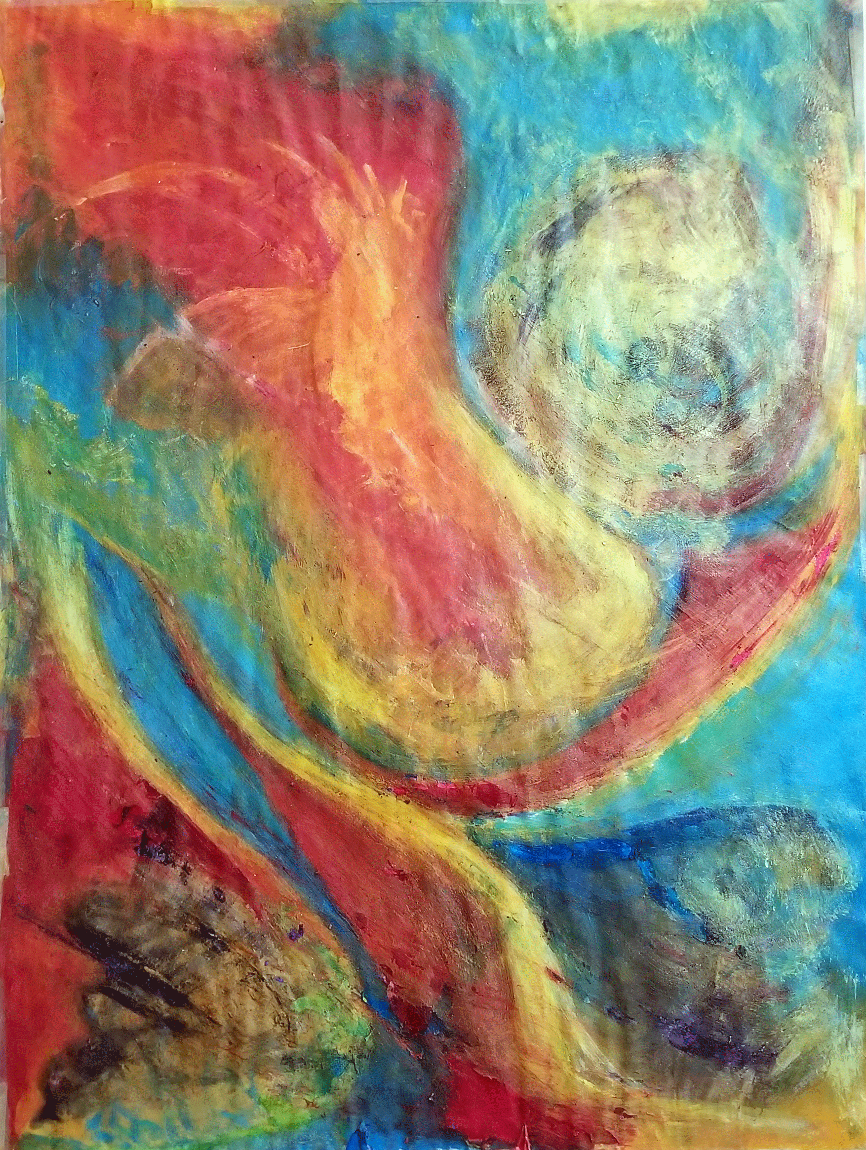
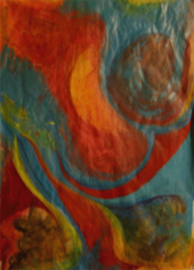
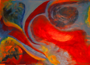
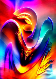
PHOENIX2.0 Mixed Paint - 2010
The piece I forgot in a closet with other remnants because it didn't contribute to the original project's storyline and was too complex to be kept. After seeing it on a wall for the first time, I came to the conclusion that it was worth using and making available to the public.
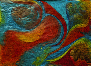
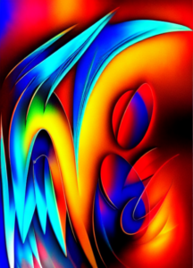
To successfully digitize Phoenix2.0, I had to deal with lighting issues and in order to solve this problem, I used Photoshop to create some evolutions of the original work. The background images used on my portfolio site were created from these pieces and they eventually blossomed into independent artworks. The formation of a template led to something different from what I anticipated, and this awakened my interest.
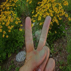
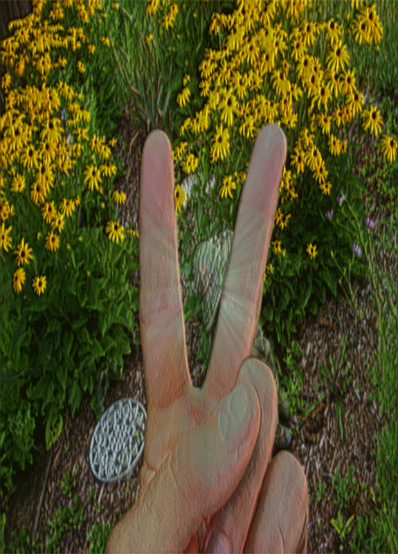
A powerful photo that speaks to the importance of understanding and accepting one another. It’s a visual representation of how important it is to try and communicate peacefully with one another. My original intention was to use it as the cover shot for my Rocks and Roses series. However, I realized that it wasn’t quite right for a series about stoic beauty. The photo is about expressing my feelings about peace more than anything else. Peace is a powerful message that needs to be both seen and heard. It speaks to the importance of understanding and accepting one another, even if we don’t always see eye-to-eye.
Graphic manipulation is a chance, it either succeeds or fails, but when I combine another misfit with a different crapshoot, I give that piece another chance.
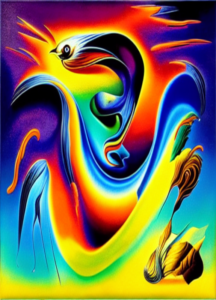
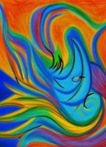
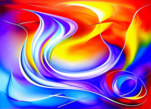
I had a title and a concept, I wanted to explore other digital tools beyond Photoshop to discover where else I could take this design. To ensure a manageable amount of works, I set a limit of 14 pieces that I consider marketable, which translates to around 100 rolls of dice. I end up with some crazy, surreal stuff that shows off my line, my curves and further emphasizes its title concept.
Like the first four mods, these mods are difficult to view together, if they are combined, the connections become evident and flow naturally.
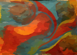
This third set is bonkers! Their orchestration is similar to the original but the execution is purely artificial. It’s like creating a digital something out of digital nothing.
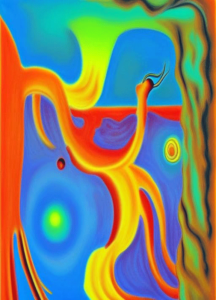
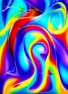
The Impressionist and final set of this series are the ones I took too far. The ones that fit and make you think about the other ones.

